Evolving a Legacy Property Brand
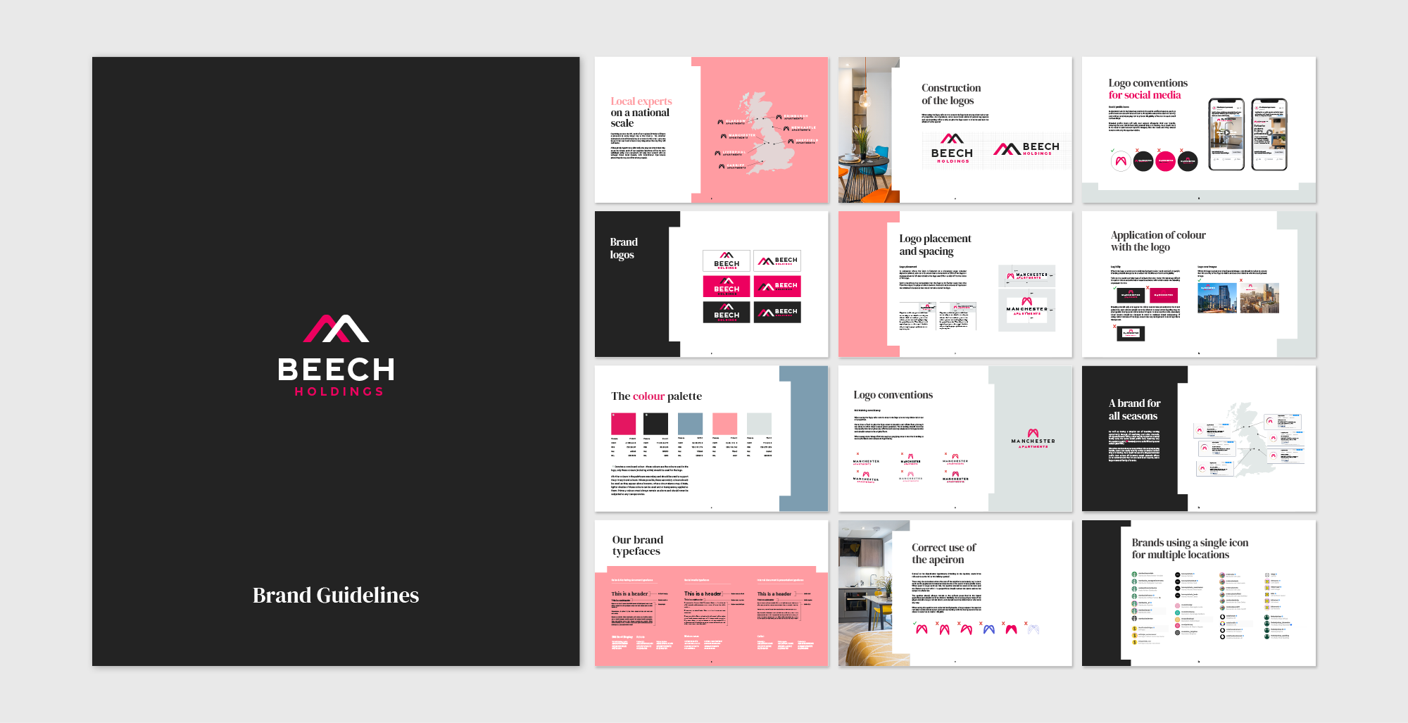
Local experts on a national scale. We were tasked with the modernisation of Manchester Apartments, a highly trusted name in the rental market known for its local expertise and national reach. The primary goal was to propel this legacy property brand into the 21st century while maintaining its established recognition among a global clientele. The core challenge lay in perfectly balancing visual evolution with brand heritage.
A Streamlined Logo Marque & Visual Identity
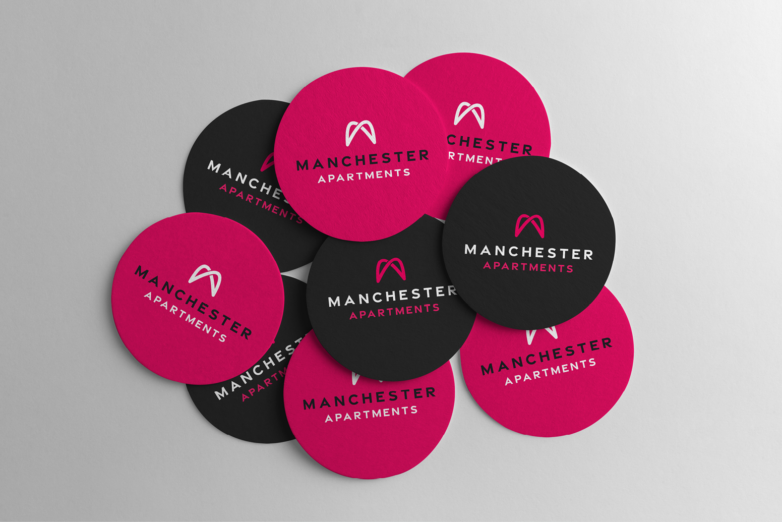
A key element of this rebranding project was the development of a modern, simplified logo marque. This streamlined design significantly improved online visibility and ensured optimal, dynamic sizing across all digital platforms.
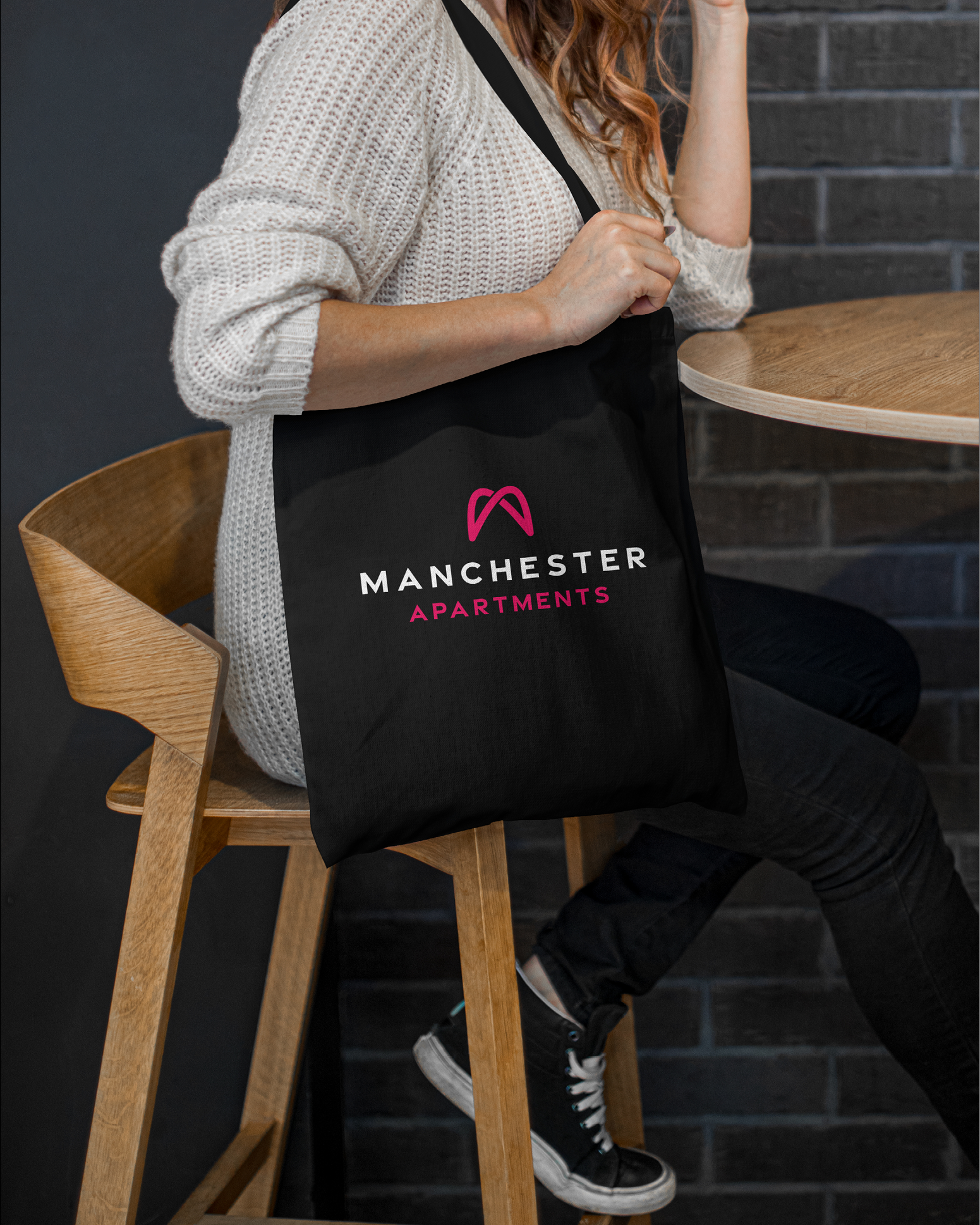
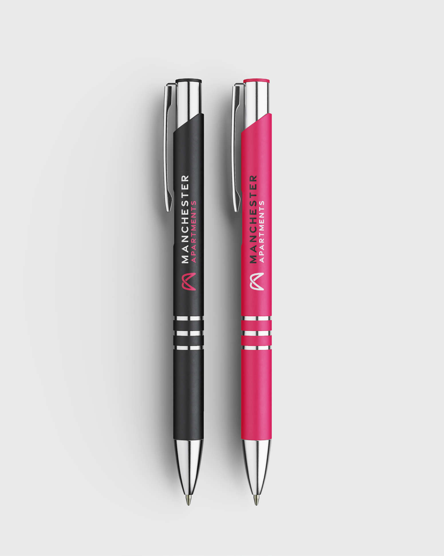
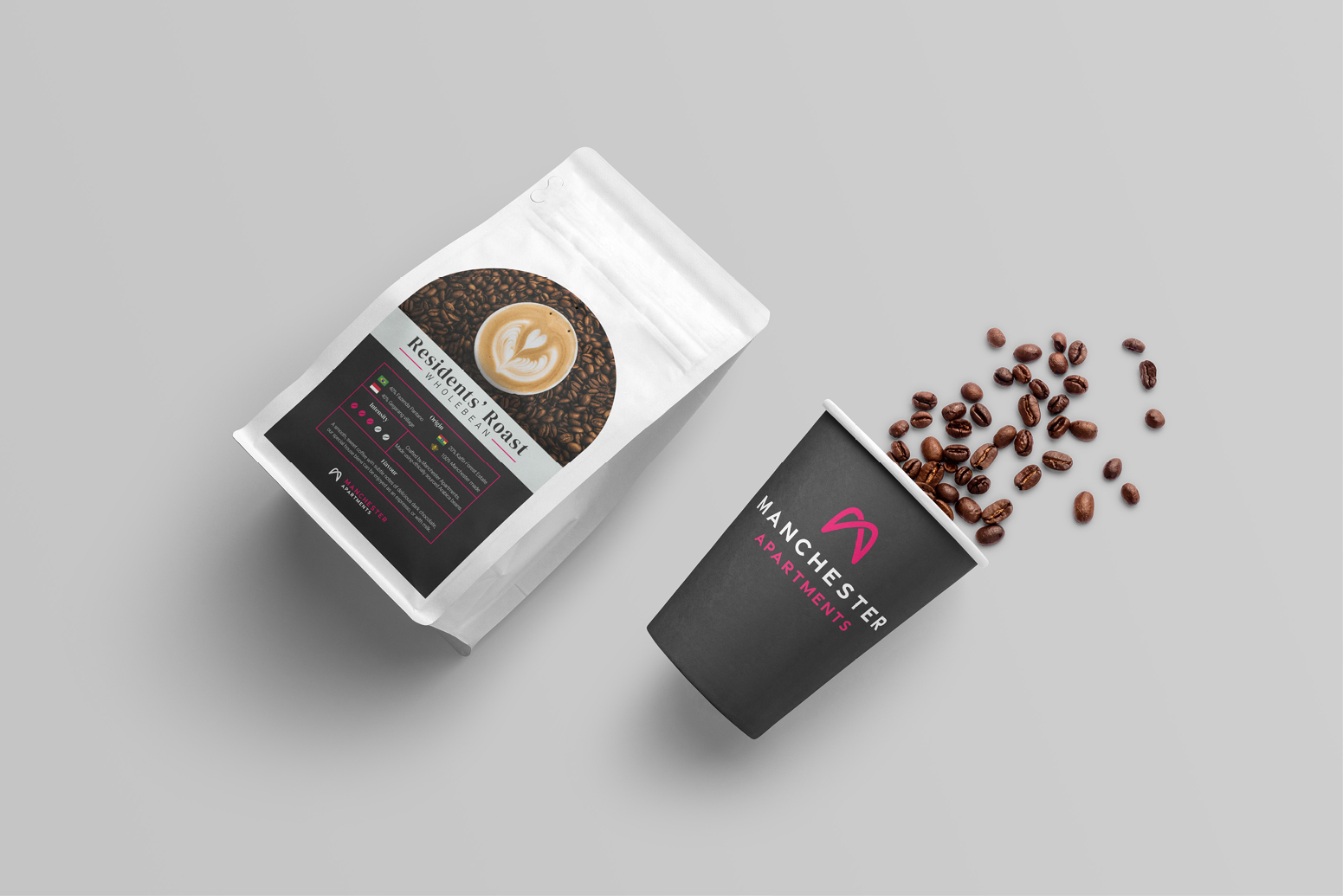
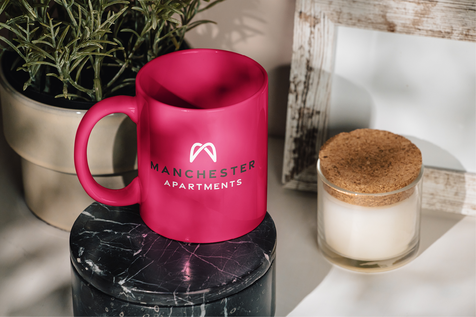
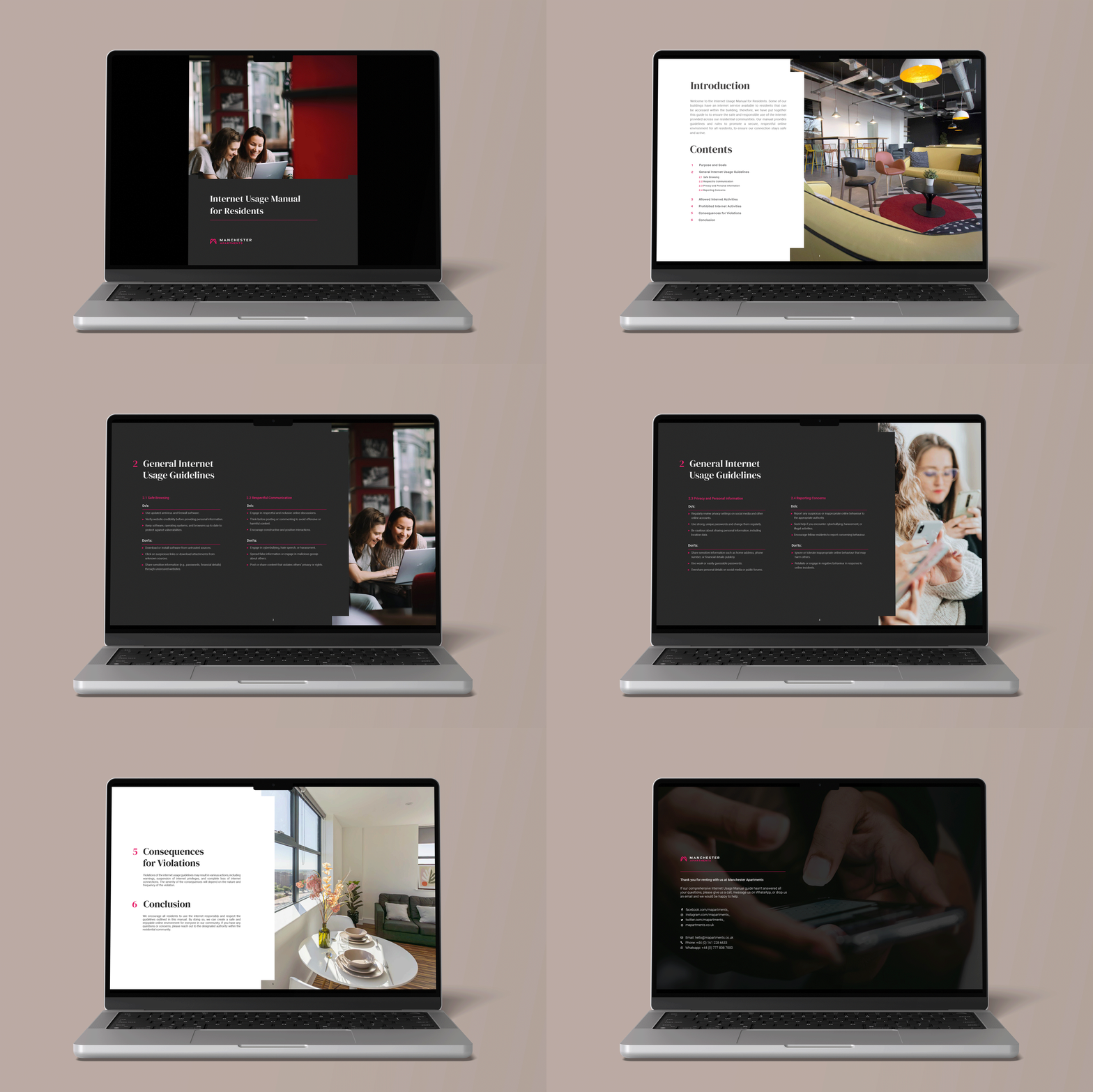
Furthermore, the brand’s visual identity was revitalised by introducing an updated, vibrant, and highly saturated colour palette. The expanded selection of secondary colours provided greater flexibility and dynamism for visual output, allowing for richer and more engaging communication across both print and screen.
Environmental Design & Campaigns
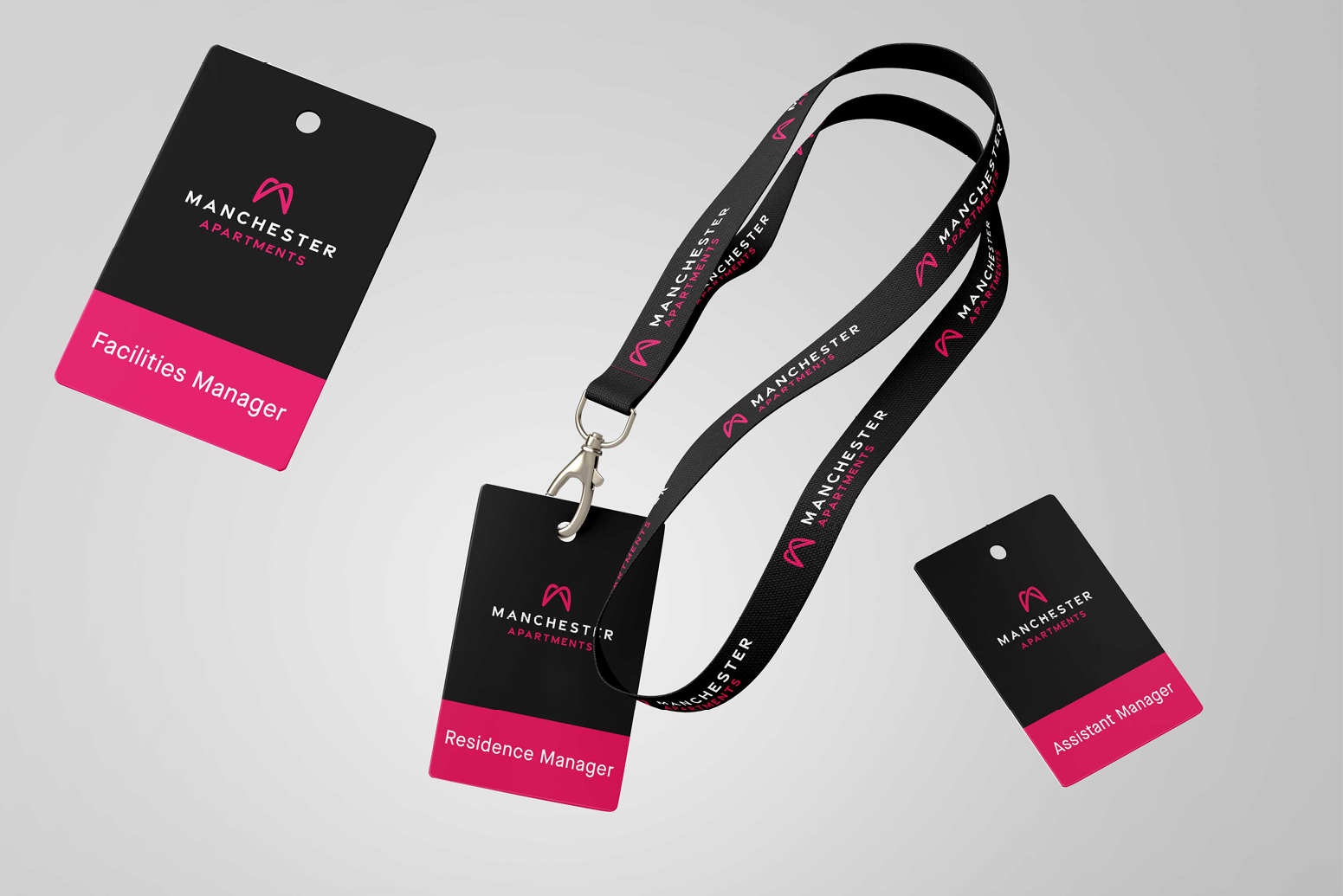
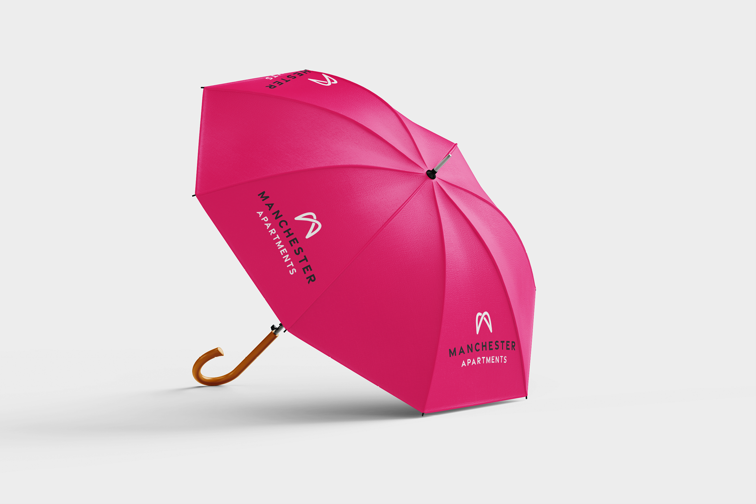
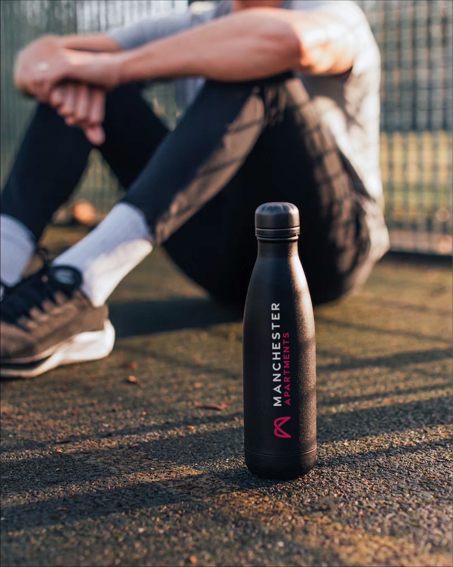
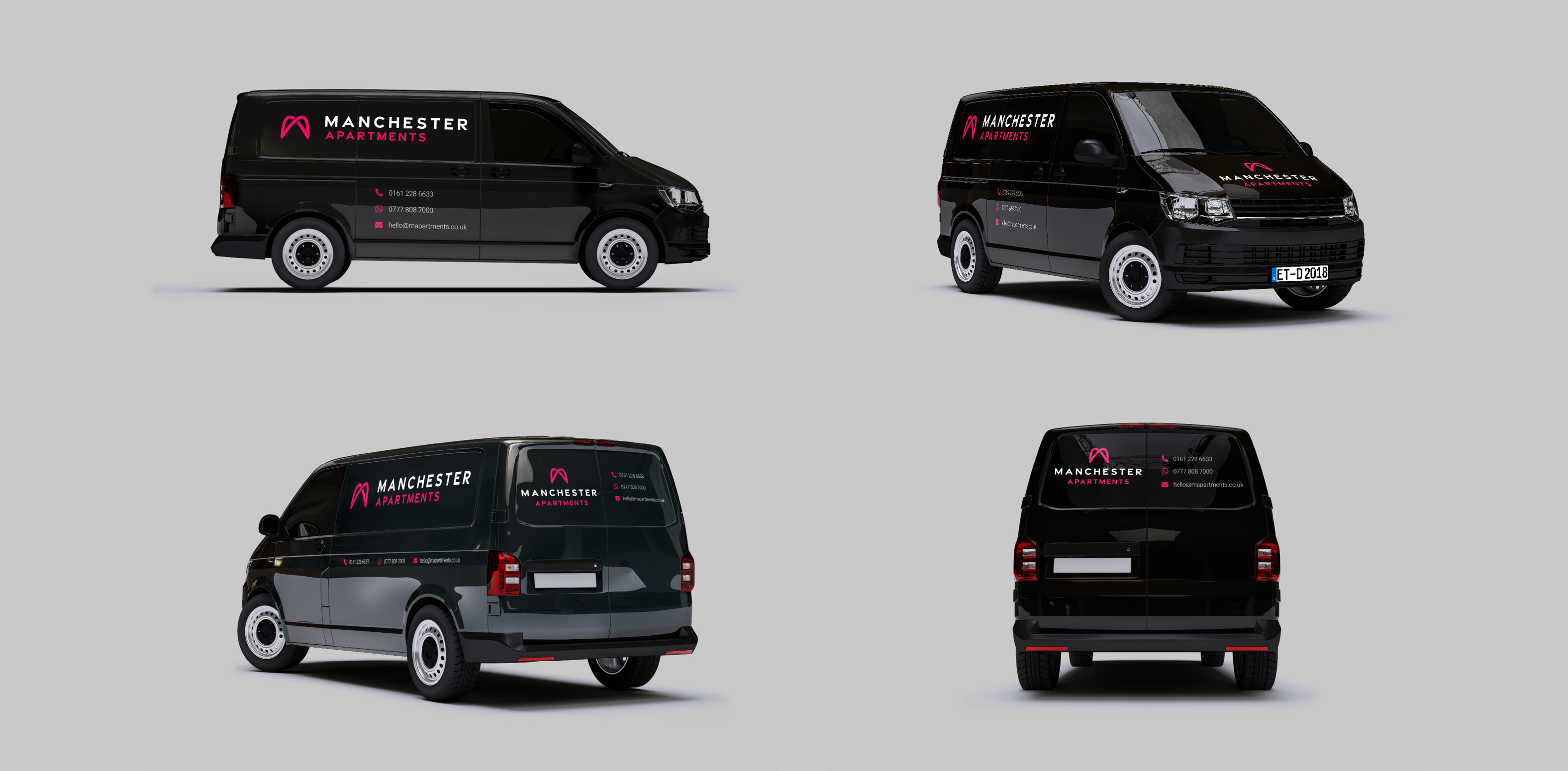
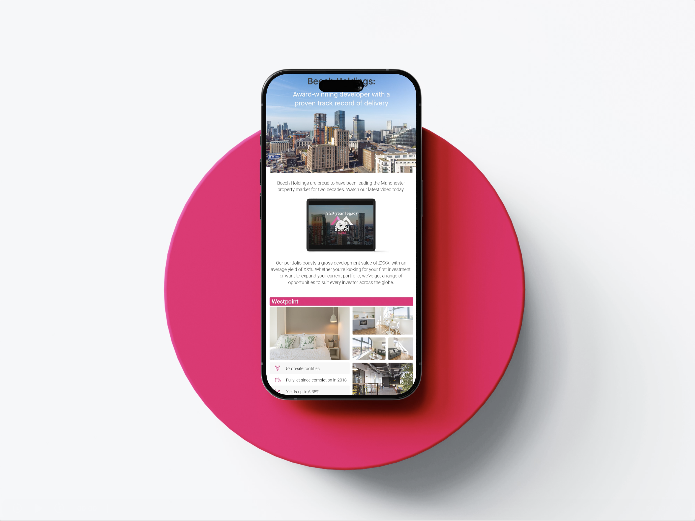
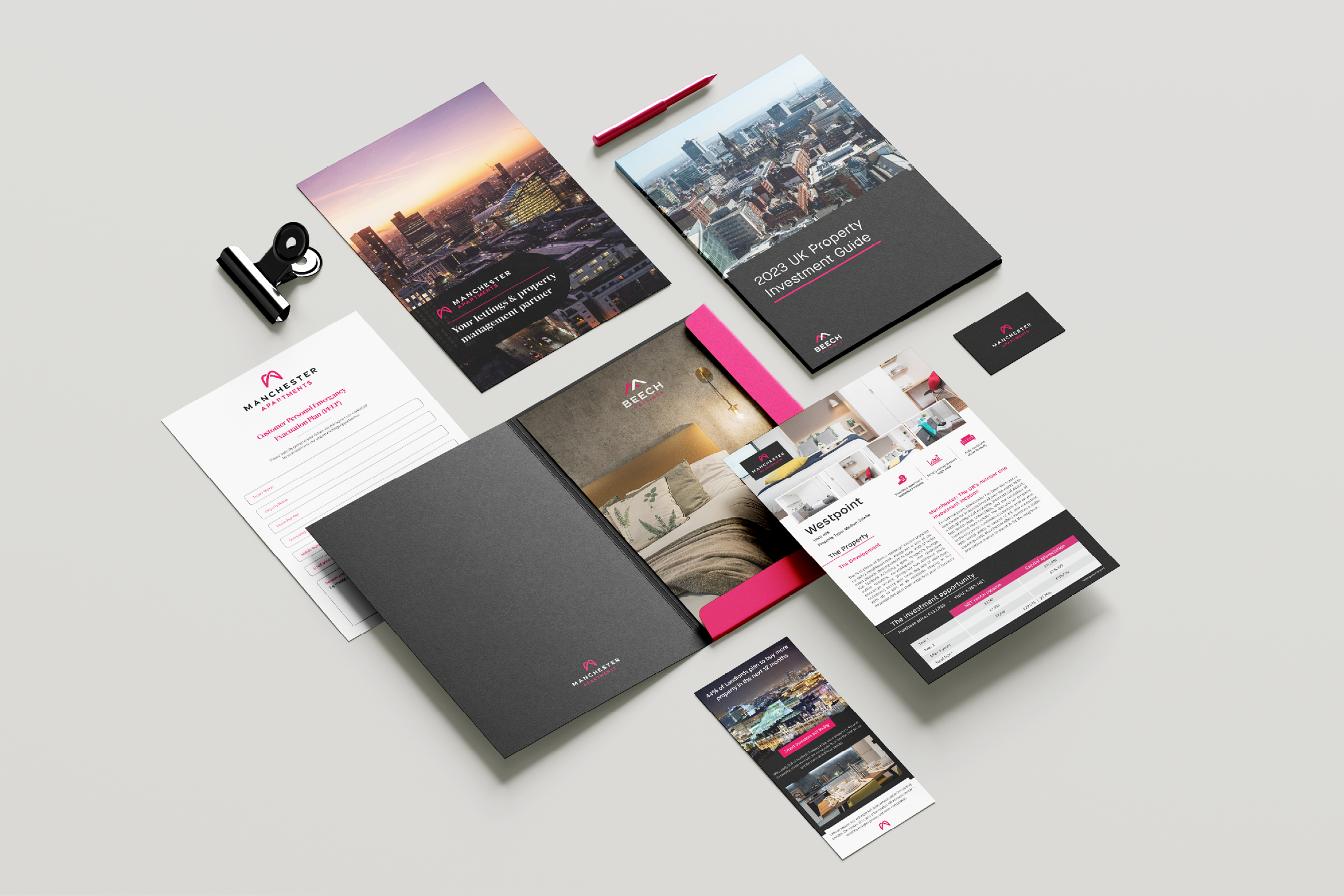
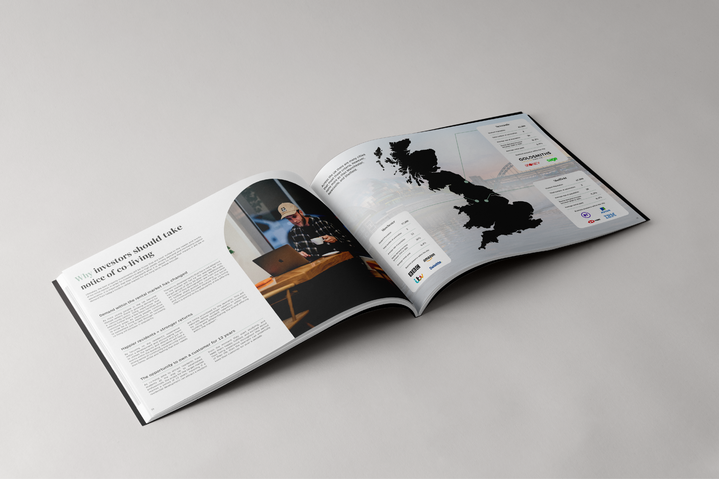
The final rollout extended beyond the screen. By incorporating striking signage and environmental design, alongside editorial design and motion graphics, the brand now presents a cohesive experience at every touchpoint. This refreshed aesthetic successfully resonates with a new generation of young professional renters while deeply respecting the brand’s long-standing heritage in the property market.